
hmd.link
Typing long URLs in VR sucks. As of Aug 2020, the default Oculus Browser doesn’t have a way to send websites from a companion device to the headset, which means you have to type each URL out by hand using the finicky virtual keyboard and motion controls. There had to be a better way…
I wondered, how can we get a link to a headset without having to remember any special codes or sign into a service? The answer lies in a clever service called ShareDrop, an AirDrop replacement for the web. The trick is to assign visitors to private rooms based on their public IP, which limits connectivity to within a local network.
Initial prototype
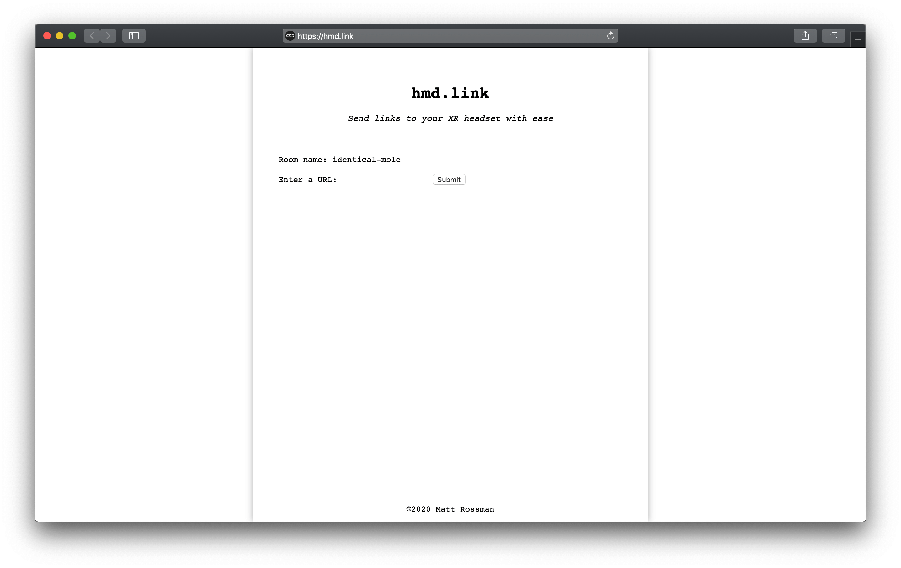
At this point in time I was learning how to use React (actually Preact, for its small size) and thought this would be a perfect opportunity to apply my skills. First I wanted to secure a domain. Luckily I snagged a short yet expressive one, hmd.link, for just $5. I built a rough prototype with Netlify and Firebase, which was funcitonal but not pretty:
I spent a while frantically switching between build tools like Parcel and Webpack because I ran into features that were unsupported by one or the other. Eventually I settled on Webpack, because while it’s a pain to set up, it has the most overall support.
Design
The initial goals:
- Low friction, keep it to one page
- Transparent process, show all steps at once
Here’s the inital sketch from InVision:
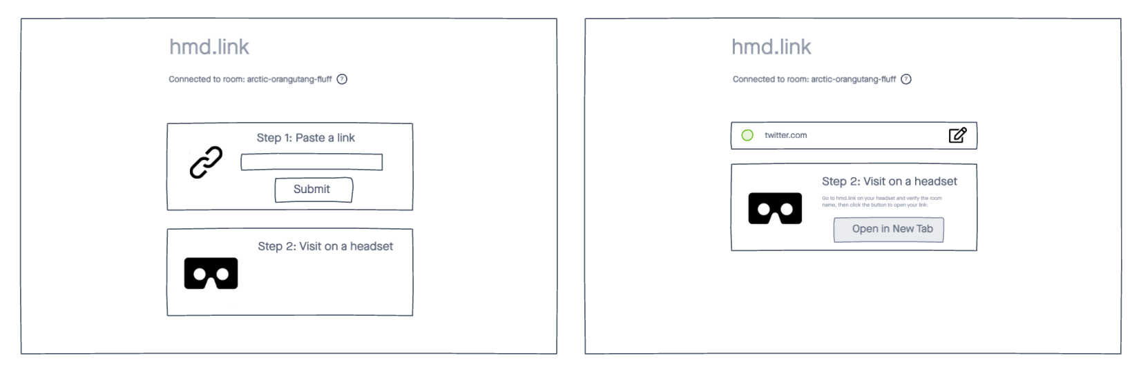
Once I started implementing this, particularly while considering the layout on mobile devices, I realized that always showing both steps was a waste of precious screen space. This led to a redesign that kept the two steps as seperate views:
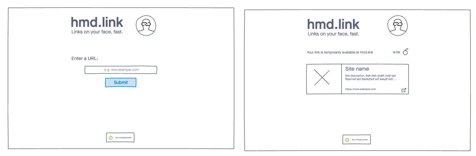
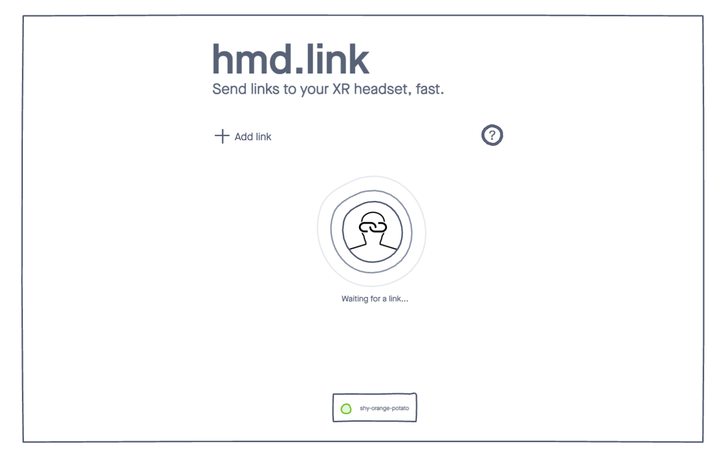
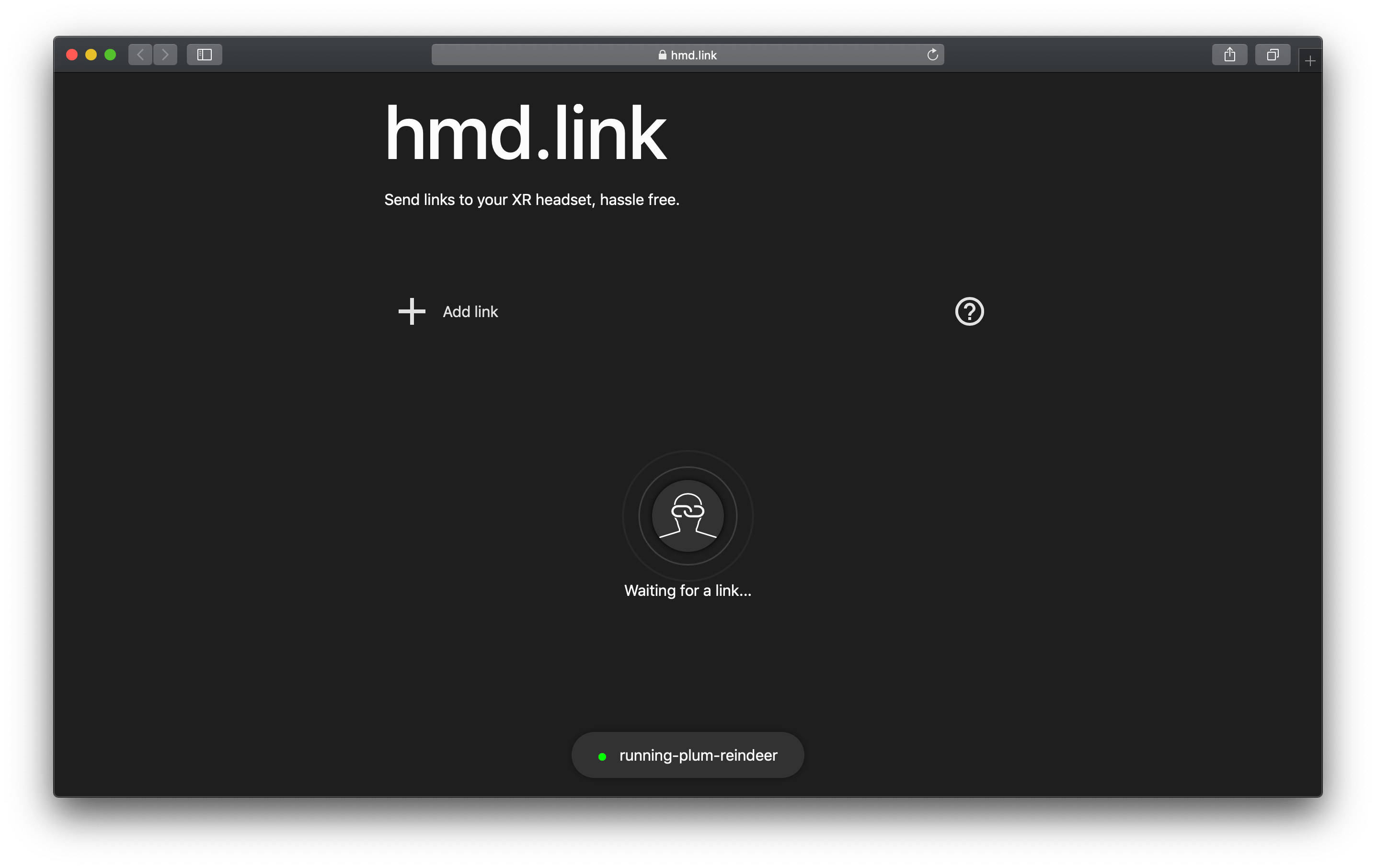
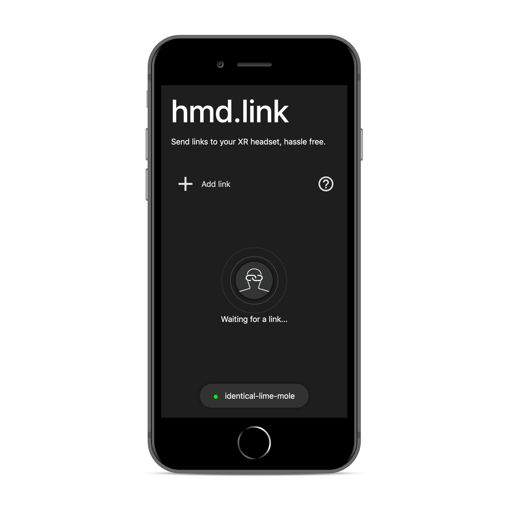
Lastly, I noticed that this UX was a little overwhelming for new users, as it didn’t clearly communicate a conceptual model for how the site works. Instead of jumping straight into the “Enter a URL” screen, I wanted to show users that the site provides a space for them to put links, and offer them a means to do so. This led to the design of this “waiting” page, which incorporates a nice animation that conveys that there is some networking going on and that users are expected to take some action (enter a link). This also gave me a space to add an info button to provide clearer instructions.
The waiting screen is replaced by the link preview when a link is stored, so this flow doesn’t slow things down on the headset side.
End result
The layout is responsive, so it works great on mobile as too:
Feedback
Here’s what some folks in the XR community on Twitter had to say:
This is by far the best solution thus far to the problem of sending links via a web browser! It's just **barely** beyond my 30 second test, but with some small tweaks could easily get there! Highly recommend checking it out! https://t.co/ZEuRqXbKx4
— Gerald McAlister (@gemisisDev) August 12, 2020
Now that @firefox @mozillaReality is no more 😢 https://t.co/EwS8VvdaF7 this becomes a crucial service.
— Fabien Benetou (@utopiah) September 25, 2020
For #WebXR to thrive, sharing a link should remain trivial regardless of platforms. 🦾 https://t.co/Rhe59rHPNf